 by
by Uncovering the Secret Smile in the Coca-Cola Logo: What You Never Noticed
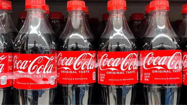
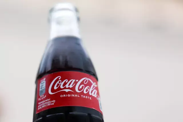
The Coca-Cola logo is one of the world’s most recognizable brand marks. Its flowing white script on a red background has endured for over a century, even while the company has introduced new flavors and packaging variants. Yet within that elegant simplicity, some experts say there lies a secret message many never notice.
The “Smile” in the Second C
Richard Lau, president of LOGO.com, suggests that the logo’s second “C” carries a subtle symbolism. According to Lau, the extended tail of that letter curves in a way that mirrors a smile—a clever visual cue.
“Businesses cannot overlook the value a great logo holds; they are the connection between a company and potential customers,” he explains. And that curved “C” is not just decorative. It “subconsciously reflects Coca-Cola’s emphasis on happiness and joy.” (UNILAD)
Though many see only a stylized script, that small flourish may gently prime viewers to feel positive emotions the moment they look at it. What starts as a letter becomes a quiet brand message.
Why It Matters (Even If You Don’t Notice)
Designers know that effective logos do more than just look good. They embed cues—shapes, directions, negative space—that can influence perception. This kind of subliminal messaging isn’t new. Reader’s Digest and other sources cite the extended loop on the “C” as a popular example of hidden logo symbolism. (rd.com)
That said, the effectiveness of such hidden cues is hard to quantify. Most viewers won’t consciously register the “smile”—but the brand still benefits from the warm tone it sets.
A Brief Timeline of the Coca-Cola Logo
To appreciate how that “smile” evolved, it helps to understand the logo’s visual journey. (Logo Design Love)
| Era | Evolution & Changes |
|---|---|
| 1886 | The Coca-Cola name and script were conceived by Frank Mason Robinson, using Spencerian script—a popular formal handwriting style of the era. (Logo Design Love) |
| Late 1800s–Early 1900s | Variations with extra swirls appeared; “Trade Mark Registered” was added to the tail of the first “C.” (Fine Print Art) |
| 1958 | The “fishtail” (Arciform) logo was introduced as a new framing shape around the script. (Fine Print Art) |
| 1969 | Coca-Cola introduced the “Dynamic Ribbon Device” (a white wave beneath the script) inside a red box—marking the modern brand visual. (coca-colacompany.com) |
| 2000s–Present | The ribbon and script have been refined for digital formats, but the core red-white, flowing-lettered identity remains. (coca-colacompany.com) |
Through each update, the core script has stayed remarkably consistent. It’s in this continuity that small adjustments—like the “smile” in the “C”—carry extra weight.
Recipe Changes Don’t Touch the Logo
While the visual brand has been stable, Coca-Cola’s formula has seen occasional updates—especially regionally. For example, in the U.S., the drink is typically sweetened with high-fructose corn syrup, whereas in Mexico and parts of Europe, cane sugar is used. (Investopedia)
Recently, Coca-Cola announced plans in the U.S. to offer a version made with cane sugar to expand its product range. But even as ingredients shift, the company seems committed to preserving the visual identity tied to its legacy.
Why Logos Matter More Than You Think
A logo is much more than a name in stylized letters—it’s the visual handshake between a brand and its audience. As Lau notes, a logo is the connection point—what customers remember most. (opposingviews.com)
That’s why logos often contain hidden cues: to evoke emotion, signal values, or build affinity. The modest “smile” in the Coca-Cola logo is a soft but smart way to align the brand with joy—without spelling it out.
Featured Image Credit: Justin Sullivan/Getty Images